Essential Oils | Lifelines
CHALLENGE:
Design an essential oil system that feels tactile, expressive, and distinctive across scents, sizes, and seasonal iterations while maintaining a cohesive family across 7.5 ml and 3 ml bottles. Each bottle needed strong shelf impact, clarity, and premium detail at a small scale.
PROCESS:
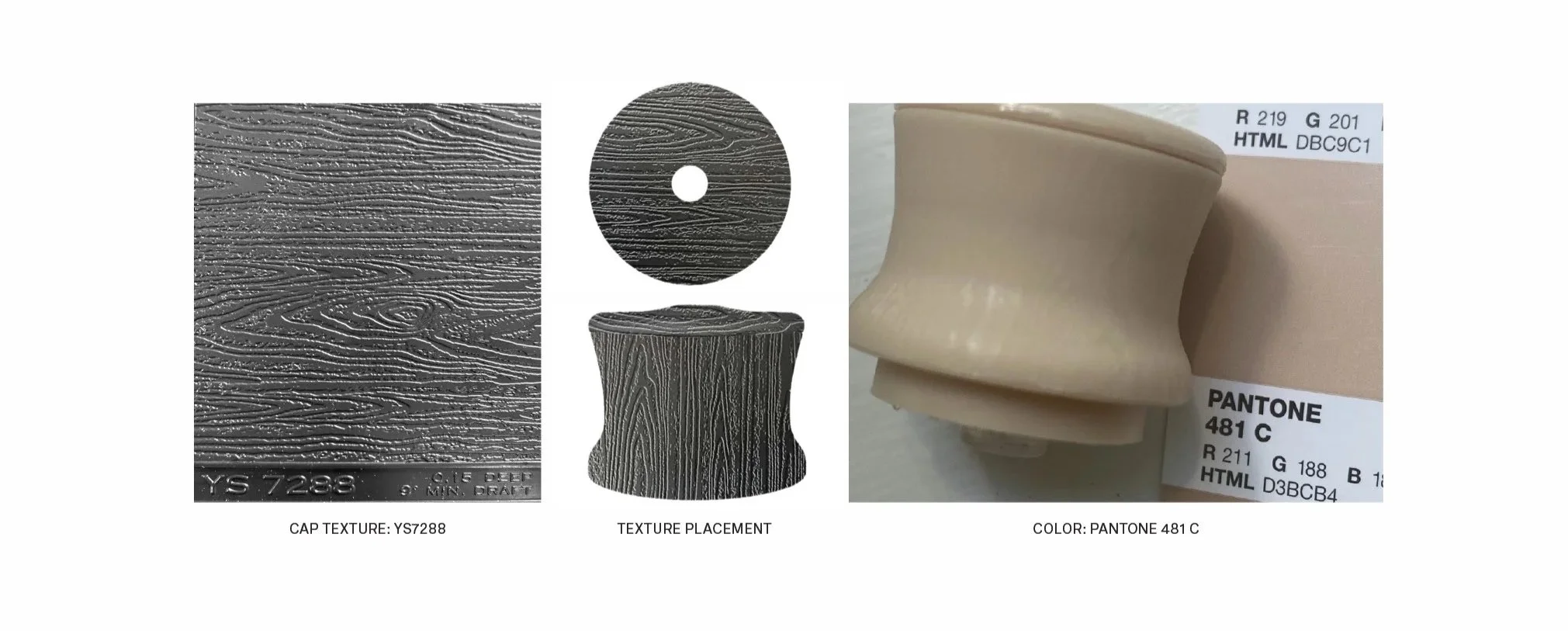
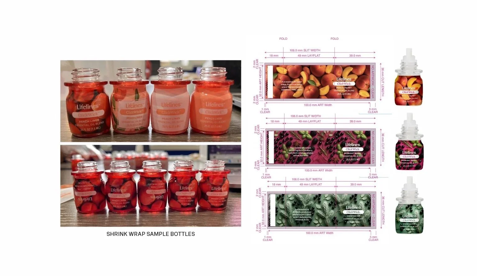
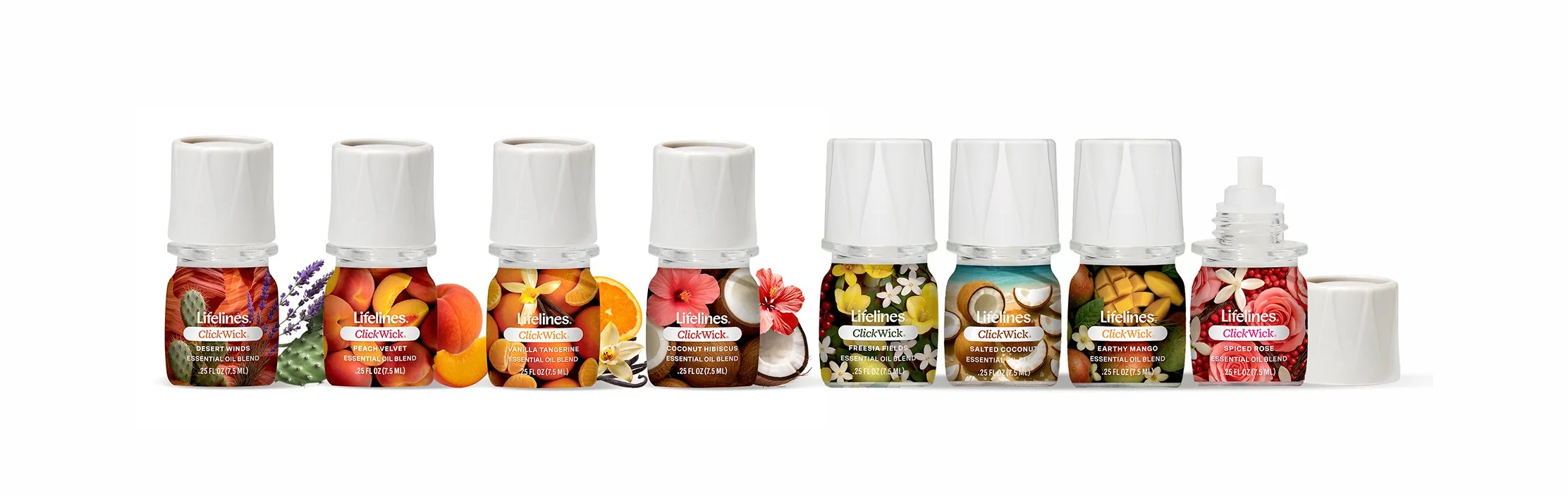
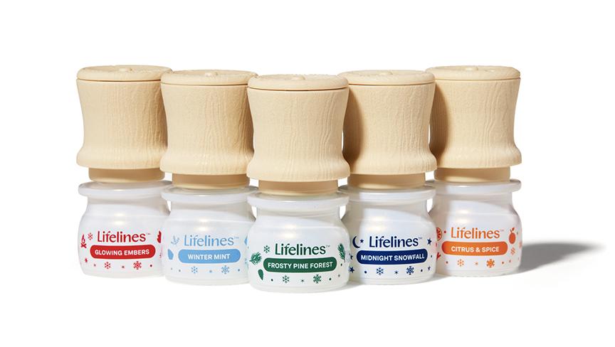
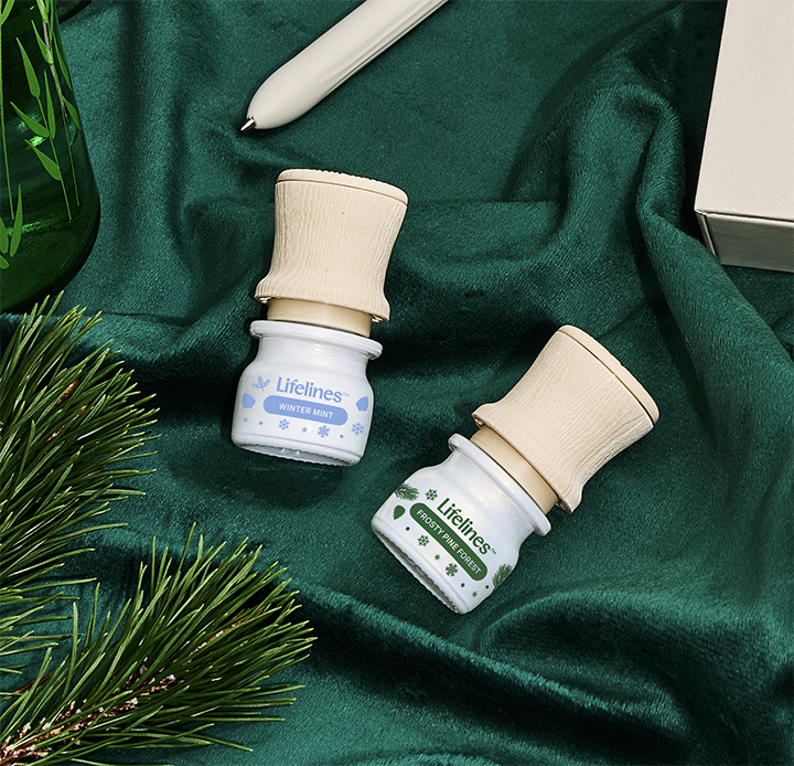
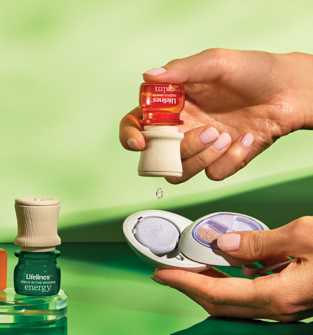
The bottles were developed as a cohesive CMF and graphic system, with a woodgrain texture applied to the precision dropper cap to create a tactile moment while reinforcing the natural wellness narrative.
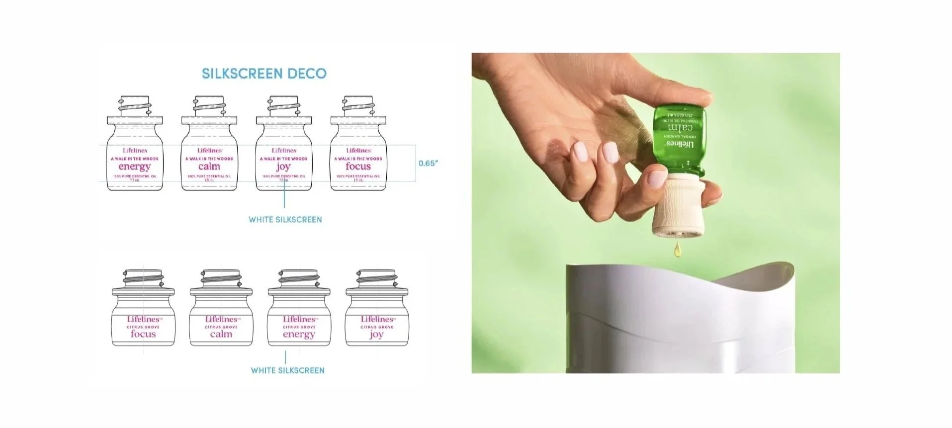
Gem-toned glass differentiated each scent while maintaining consistency across both 7.5 ml and 3 ml formats. Graphics were designed to follow the bottle curvature and maintain clarity at a very small scale.
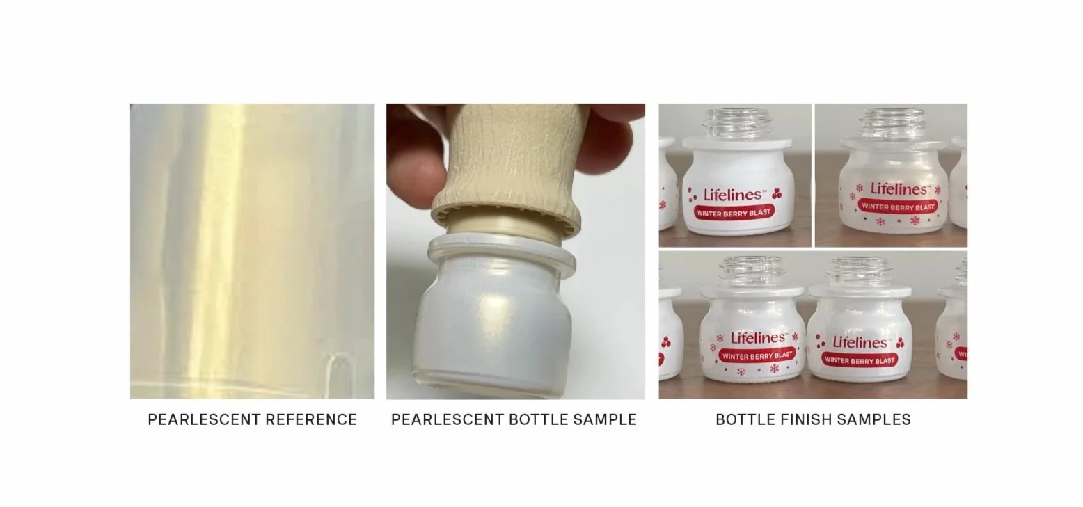
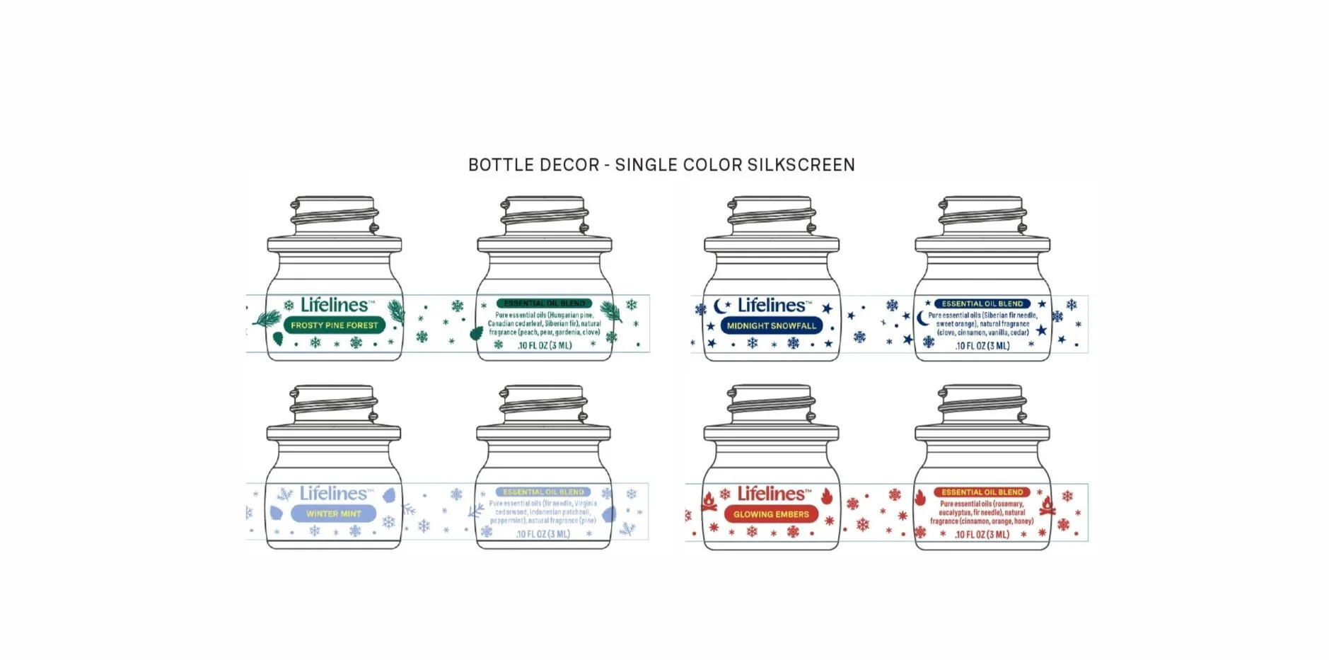
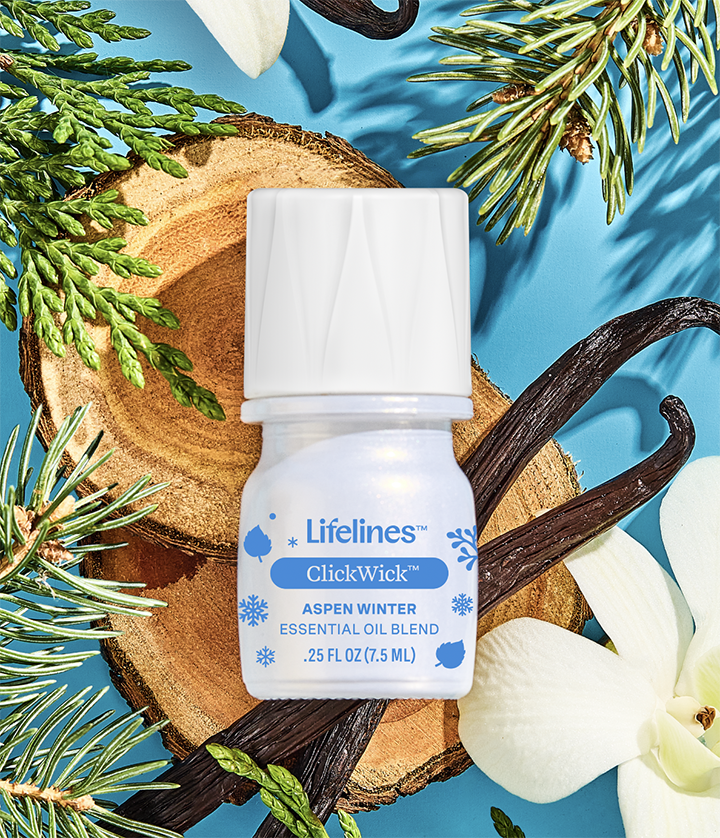
Holiday editions extended the system with pearlescent bottles and wraparound screen graphics, as well as scent-driven shrink-wrapped bottles that used color and imagery to express fragrance character while remaining visually cohesive.